Why Your Business Website Is Not Converting Visitors

Daud K
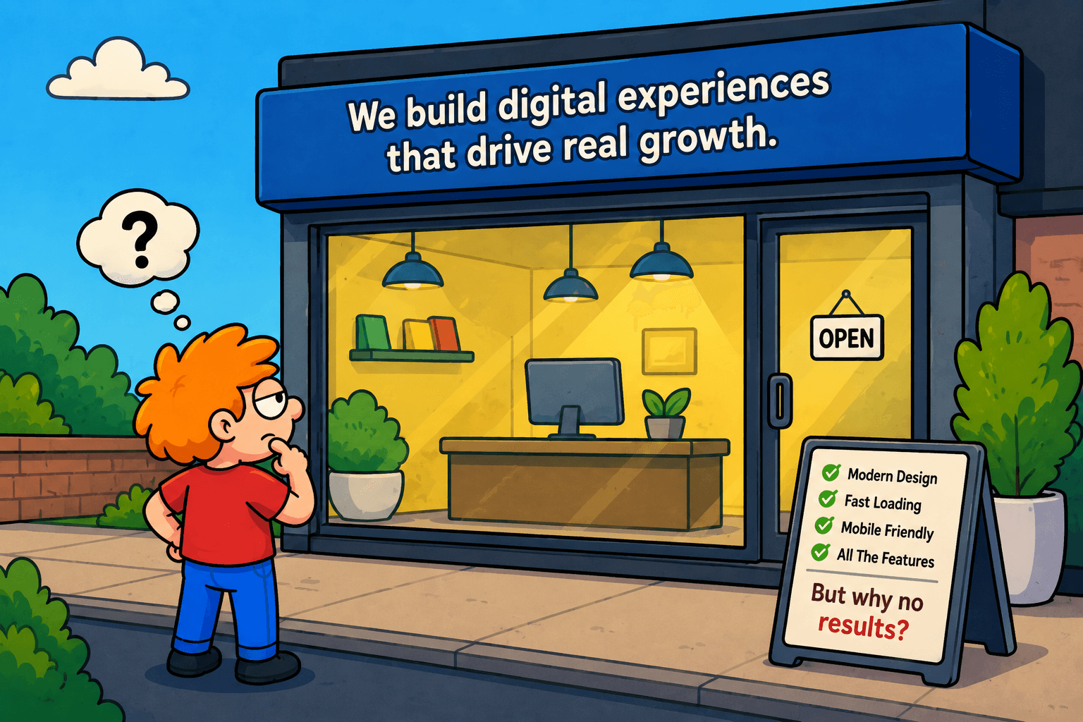
Your Website Looks Good. So Why Is It Not Working?
There is an uncomfortable situation many businesses eventually run into. They have invested in a professional website, the branding looks polished, the pages work properly, and nothing appears obviously wrong. Yet the website still does very little for the business.
Visitors arrive but rarely get in touch. Important services receive little attention. Paid campaigns send traffic without producing enough enquiries. People visit a few pages and disappear. Eventually, someone suggests another redesign.
The immediate assumption is usually that the website needs to look better. Sometimes it does, but visual design is rarely the whole problem. A website can be beautifully designed and still fail because its message is unclear, its structure does not reflect what visitors are looking for, or it gives people no convincing reason to take the next step.
A business website should certainly look good, but more importantly, it needs to understand the job it has been hired to do.
Start With the Reason Someone Came to Your Website
Businesses naturally think about websites from their own perspective. They organize pages around departments, internal terminology, service categories, and information they want customers to know.
Visitors arrive with a completely different mindset.
Someone searching for a software development partner may want to know whether you have experience building products similar to theirs. A potential customer comparing professional services may be looking for evidence that your team understands their industry. Someone who discovered you through an advertisement probably expects the website to continue the same conversation that convinced them to click.
If the first thing they encounter is a broad headline such as “Transforming Businesses Through Innovation,” followed by several paragraphs explaining how passionate the company is, they still have work to do before understanding whether they are in the right place.
Good website strategy reduces that work. It makes the important information obvious without making the experience feel simplistic.
The Homepage Is Not Your Website
Businesses often spend a disproportionate amount of time perfecting the homepage. It receives the strongest imagery, the most carefully written headline, and usually the most internal debate.
Meanwhile, many potential customers will never enter through it.
Someone searching for a specific service may arrive directly on a service page. A person following a case study shared on LinkedIn might first encounter the company through that project. Paid campaigns often use dedicated landing pages, while organic search can bring visitors into articles written months earlier.
This changes how a website should be designed.
Every important page needs enough context to work as an entry point. A service page should not assume someone already understands the company. A case study should make it easy to explore related expertise. An article should provide a natural path toward learning more without turning into an advertisement halfway through.
Thinking this way creates a website that works as a connected system rather than a homepage with supporting pages attached to it.
Good Design Should Make Decisions Easier
One of the most useful things design can do is help people decide what matters.
Imagine a service page containing an introduction, six capabilities, several statistics, three testimonials, client logos, a process, frequently asked questions, two videos, four calls to action, and a contact form. Every individual section may be useful, but putting all of them together does not automatically create a useful experience.
The designer's job is not simply to make all that content attractive. It is to establish hierarchy.
What does someone need to understand first? What information helps build confidence? Which details should be available for visitors who want to go deeper? At what point does asking someone to contact the company feel reasonable?
These decisions are part of user experience design, but they are also business decisions. When the hierarchy is right, the website feels easier to use because visitors are not being asked to process everything at once.
Traffic Cannot Rescue a Weak Experience
A website that is not converting often leads to another response: increase traffic.
The logic seems reasonable. If one hundred visitors generate two enquiries, perhaps one thousand visitors will generate twenty.
In practice, increasing traffic to a weak experience can simply make the inefficiency more expensive.
Suppose a company runs a campaign promoting a very specific service. The advertisement clearly explains the problem and attracts the right audience. When visitors click, however, they land on a general services page containing eight different offerings. The conversation that started in the advertisement has suddenly changed.
The campaign may be blamed for producing poor results, even though the disconnect happened after the click.
This is why website design, conversion optimization, content, and digital marketing should not be treated as unrelated activities. The experience before and after a click needs to make sense as one journey.
SEO Is Also an Experience Problem
Search engine optimization is another area where businesses sometimes focus on the wrong end of the problem.
Ranking is important, but ranking is only useful if the page deserves the visitor once they arrive.
If someone searches for a specific question and lands on a page filled with generic information written primarily to include keywords, the website may technically have gained traffic without creating much value.
Strong SEO and strong UX have more in common than they first appear to. Both require understanding intent.
A useful service page should clearly explain the service, answer the questions potential customers are likely to have, provide evidence where appropriate, and help someone decide what to do next. An article should genuinely answer the question that brought someone there instead of stretching a simple answer across two thousand words.
SEO can help people discover a website. The experience determines whether discovering it was worthwhile.
Performance Is Part of the Design
There was a period when ambitious websites seemed determined to prove how much animation a browser could handle. Large videos, elaborate transitions, custom cursors, three dimensional scenes, and interactions appeared everywhere.
Some of those experiences are excellent. Others make visitors wait for a loading screen before they can find a phone number.
The question is not whether animation or rich interaction is good or bad. The question is whether it contributes to the experience.
A creative studio may benefit from an expressive portfolio that demonstrates its capabilities. A customer trying to make an urgent service enquiry probably values speed and clarity more than an elaborate transition between pages.
Performance should therefore be considered during design, not discovered as a technical problem at the end of development. Image sizes, fonts, video, animation, third party scripts, and the underlying technology all influence how the finished experience feels.
A fast website rarely receives compliments for being fast. People simply continue using it. That is exactly the point.
Mobile Exposes Weak Decisions Quickly
Desktop screens give designers a lot of room to hide complexity. Mobile screens do not.
When a large navigation menu, oversized headline, multiple calls to action, long paragraphs, and several competing visual elements have to fit into a much smaller space, priorities become unavoidable.
This is one reason responsive design should not mean creating the desktop website first and shrinking it later.
The mobile experience may require different navigation behaviour, shorter content presentation, reordered sections, larger touch targets, simplified interactions, or a completely different way of displaying complex information.
For many businesses, mobile is not a secondary version of the website. It may be where a significant portion of the first impression happens.
Case Studies Often Say More Than Claims
Most business websites make similar promises. They are innovative, customer focused, experienced, passionate, results driven, or some combination of all five.
Potential customers have learned to filter those words out.
Evidence is more persuasive.
A thoughtful case study can explain what problem existed, what constraints shaped the project, what decisions were made, what was actually created, and what changed as a result. It gives visitors something concrete to evaluate rather than asking them to accept another marketing claim.
Even when confidential projects make detailed metrics impossible to publish, showing the thinking behind the work can still demonstrate expertise.
This is particularly important for companies selling complex services. The more difficult your work is to explain in a headline, the more valuable real examples become.
Not Every Visitor Is Ready to Contact You
Another common mistake is designing the entire website around a single conversion.
“Book a call.”
That might be the ultimate goal, but not every visitor is ready for it.
Someone discovering the company for the first time may want to explore previous work. Another visitor may want to understand the process. Someone else might read several articles before returning weeks later with a project.
A good website supports these different levels of intent.
That could mean offering relevant case studies after a service description, connecting articles to related expertise, making contact information easy to find, or providing a clear next step without repeating the same button after every section.
Conversion design works best when it respects where someone is in their decision rather than constantly asking them to skip to the end.
A Website Should Become More Useful Over Time
Launching a website should not be the point where everyone stops thinking about it.
Once real people begin using it, businesses gain information that was not available during design. Analytics can reveal which pages attract visitors, where people leave, which services receive attention, how users move between pages, and which calls to action actually get used.
Sales and support teams provide another valuable source of information. If prospects repeatedly ask a question that the website supposedly answers, the answer may not be clear enough. If customers regularly misunderstand a service, the problem may be positioning rather than traffic.
Small improvements based on this information can often produce more value than periodically replacing the entire website.
The strongest websites are not static brochures. They evolve with the business and with what the business learns about its customers.
The Better Question Is Not “Does Our Website Look Good?”
Visual quality still matters. People form opinions quickly, and a dated or careless website can weaken confidence before someone reads a word.
But “Does it look good?” is only one question.
A more useful review would ask whether people understand the business, whether the right services are easy to discover, whether the experience works across devices, whether search engines can understand the content, whether campaigns have suitable destinations, whether the site builds credibility, and whether visitors have a clear path forward.
At Zakoum, this is why we see website design as part of a wider digital system. Strategy, UX, visual design, development, SEO, content, marketing, and data all influence whether the final experience actually works.
A beautiful website is valuable.
A beautiful website that understands its purpose is much more valuable.
Your Website Looks Good. So Why Is It Not Working?
There is an uncomfortable situation many businesses eventually run into. They have invested in a professional website, the branding looks polished, the pages work properly, and nothing appears obviously wrong. Yet the website still does very little for the business.
Visitors arrive but rarely get in touch. Important services receive little attention. Paid campaigns send traffic without producing enough enquiries. People visit a few pages and disappear. Eventually, someone suggests another redesign.
The immediate assumption is usually that the website needs to look better. Sometimes it does, but visual design is rarely the whole problem. A website can be beautifully designed and still fail because its message is unclear, its structure does not reflect what visitors are looking for, or it gives people no convincing reason to take the next step.
A business website should certainly look good, but more importantly, it needs to understand the job it has been hired to do.
Start With the Reason Someone Came to Your Website
Businesses naturally think about websites from their own perspective. They organize pages around departments, internal terminology, service categories, and information they want customers to know.
Visitors arrive with a completely different mindset.
Someone searching for a software development partner may want to know whether you have experience building products similar to theirs. A potential customer comparing professional services may be looking for evidence that your team understands their industry. Someone who discovered you through an advertisement probably expects the website to continue the same conversation that convinced them to click.
If the first thing they encounter is a broad headline such as “Transforming Businesses Through Innovation,” followed by several paragraphs explaining how passionate the company is, they still have work to do before understanding whether they are in the right place.
Good website strategy reduces that work. It makes the important information obvious without making the experience feel simplistic.
The Homepage Is Not Your Website
Businesses often spend a disproportionate amount of time perfecting the homepage. It receives the strongest imagery, the most carefully written headline, and usually the most internal debate.
Meanwhile, many potential customers will never enter through it.
Someone searching for a specific service may arrive directly on a service page. A person following a case study shared on LinkedIn might first encounter the company through that project. Paid campaigns often use dedicated landing pages, while organic search can bring visitors into articles written months earlier.
This changes how a website should be designed.
Every important page needs enough context to work as an entry point. A service page should not assume someone already understands the company. A case study should make it easy to explore related expertise. An article should provide a natural path toward learning more without turning into an advertisement halfway through.
Thinking this way creates a website that works as a connected system rather than a homepage with supporting pages attached to it.
Good Design Should Make Decisions Easier
One of the most useful things design can do is help people decide what matters.
Imagine a service page containing an introduction, six capabilities, several statistics, three testimonials, client logos, a process, frequently asked questions, two videos, four calls to action, and a contact form. Every individual section may be useful, but putting all of them together does not automatically create a useful experience.
The designer's job is not simply to make all that content attractive. It is to establish hierarchy.
What does someone need to understand first? What information helps build confidence? Which details should be available for visitors who want to go deeper? At what point does asking someone to contact the company feel reasonable?
These decisions are part of user experience design, but they are also business decisions. When the hierarchy is right, the website feels easier to use because visitors are not being asked to process everything at once.
Traffic Cannot Rescue a Weak Experience
A website that is not converting often leads to another response: increase traffic.
The logic seems reasonable. If one hundred visitors generate two enquiries, perhaps one thousand visitors will generate twenty.
In practice, increasing traffic to a weak experience can simply make the inefficiency more expensive.
Suppose a company runs a campaign promoting a very specific service. The advertisement clearly explains the problem and attracts the right audience. When visitors click, however, they land on a general services page containing eight different offerings. The conversation that started in the advertisement has suddenly changed.
The campaign may be blamed for producing poor results, even though the disconnect happened after the click.
This is why website design, conversion optimization, content, and digital marketing should not be treated as unrelated activities. The experience before and after a click needs to make sense as one journey.
SEO Is Also an Experience Problem
Search engine optimization is another area where businesses sometimes focus on the wrong end of the problem.
Ranking is important, but ranking is only useful if the page deserves the visitor once they arrive.
If someone searches for a specific question and lands on a page filled with generic information written primarily to include keywords, the website may technically have gained traffic without creating much value.
Strong SEO and strong UX have more in common than they first appear to. Both require understanding intent.
A useful service page should clearly explain the service, answer the questions potential customers are likely to have, provide evidence where appropriate, and help someone decide what to do next. An article should genuinely answer the question that brought someone there instead of stretching a simple answer across two thousand words.
SEO can help people discover a website. The experience determines whether discovering it was worthwhile.
Performance Is Part of the Design
There was a period when ambitious websites seemed determined to prove how much animation a browser could handle. Large videos, elaborate transitions, custom cursors, three dimensional scenes, and interactions appeared everywhere.
Some of those experiences are excellent. Others make visitors wait for a loading screen before they can find a phone number.
The question is not whether animation or rich interaction is good or bad. The question is whether it contributes to the experience.
A creative studio may benefit from an expressive portfolio that demonstrates its capabilities. A customer trying to make an urgent service enquiry probably values speed and clarity more than an elaborate transition between pages.
Performance should therefore be considered during design, not discovered as a technical problem at the end of development. Image sizes, fonts, video, animation, third party scripts, and the underlying technology all influence how the finished experience feels.
A fast website rarely receives compliments for being fast. People simply continue using it. That is exactly the point.
Mobile Exposes Weak Decisions Quickly
Desktop screens give designers a lot of room to hide complexity. Mobile screens do not.
When a large navigation menu, oversized headline, multiple calls to action, long paragraphs, and several competing visual elements have to fit into a much smaller space, priorities become unavoidable.
This is one reason responsive design should not mean creating the desktop website first and shrinking it later.
The mobile experience may require different navigation behaviour, shorter content presentation, reordered sections, larger touch targets, simplified interactions, or a completely different way of displaying complex information.
For many businesses, mobile is not a secondary version of the website. It may be where a significant portion of the first impression happens.
Case Studies Often Say More Than Claims
Most business websites make similar promises. They are innovative, customer focused, experienced, passionate, results driven, or some combination of all five.
Potential customers have learned to filter those words out.
Evidence is more persuasive.
A thoughtful case study can explain what problem existed, what constraints shaped the project, what decisions were made, what was actually created, and what changed as a result. It gives visitors something concrete to evaluate rather than asking them to accept another marketing claim.
Even when confidential projects make detailed metrics impossible to publish, showing the thinking behind the work can still demonstrate expertise.
This is particularly important for companies selling complex services. The more difficult your work is to explain in a headline, the more valuable real examples become.
Not Every Visitor Is Ready to Contact You
Another common mistake is designing the entire website around a single conversion.
“Book a call.”
That might be the ultimate goal, but not every visitor is ready for it.
Someone discovering the company for the first time may want to explore previous work. Another visitor may want to understand the process. Someone else might read several articles before returning weeks later with a project.
A good website supports these different levels of intent.
That could mean offering relevant case studies after a service description, connecting articles to related expertise, making contact information easy to find, or providing a clear next step without repeating the same button after every section.
Conversion design works best when it respects where someone is in their decision rather than constantly asking them to skip to the end.
A Website Should Become More Useful Over Time
Launching a website should not be the point where everyone stops thinking about it.
Once real people begin using it, businesses gain information that was not available during design. Analytics can reveal which pages attract visitors, where people leave, which services receive attention, how users move between pages, and which calls to action actually get used.
Sales and support teams provide another valuable source of information. If prospects repeatedly ask a question that the website supposedly answers, the answer may not be clear enough. If customers regularly misunderstand a service, the problem may be positioning rather than traffic.
Small improvements based on this information can often produce more value than periodically replacing the entire website.
The strongest websites are not static brochures. They evolve with the business and with what the business learns about its customers.
The Better Question Is Not “Does Our Website Look Good?”
Visual quality still matters. People form opinions quickly, and a dated or careless website can weaken confidence before someone reads a word.
But “Does it look good?” is only one question.
A more useful review would ask whether people understand the business, whether the right services are easy to discover, whether the experience works across devices, whether search engines can understand the content, whether campaigns have suitable destinations, whether the site builds credibility, and whether visitors have a clear path forward.
At Zakoum, this is why we see website design as part of a wider digital system. Strategy, UX, visual design, development, SEO, content, marketing, and data all influence whether the final experience actually works.
A beautiful website is valuable.
A beautiful website that understands its purpose is much more valuable.
Have Something
Great in Mind?
Tell us what you are working on. We will bring the strategy, creativity, and technology to help turn it into something real.